The Power of Subtle Color Edits
Why color correction should remain gentle and precise GIMP
When preparing a photo for social sharing, color plays a critical role in shaping its mood and overall impact. However, it’s easy to slip into extremes by pushing hues, saturation, or tones too far. Subtle adjustments often create the most visually pleasing results. When done carefully, color correction brings out the natural essence of a scene, enhancing its warmth, depth, and emotion without altering reality. Over-editing leads to unnatural skin tones, lost detail, and jarring visuals—exactly what should be avoided.
Start with White Balance Correction
Make whites look natural before refining color
White balance is the foundation of proper color presentation. It controls how warm or cool your photo appears and affects all the other colors within the frame. A photo with incorrect white balance might look too blue, yellow, or green, even if everything else is sharp. Correcting it ensures that whites appear true, skin tones stay flattering, and skies or foliage reflect their real-life colors. Tools like GIMP offer intuitive sliders to help you shift white balance in fine increments. (Important!) Always start here before applying filters or tone changes.
Warm Tones for Sunsets and Skin
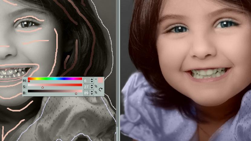
Use gentle warmth to create mood and comfort
Sunset photos and portraits often benefit from warmer color tones. These tones can evoke calmness, nostalgia, or warmth, enhancing emotional resonance. Slightly increasing the red or orange channels helps sunset skies glow without making them look artificial. Similarly, adding warmth to skin tones makes portraits feel more lively and human. The key is moderation: push just enough to boost appeal but not enough to make the image look orange or tinted. A well-placed warmth adjustment invites connection.
Cool Down Harsh Blue Tints
Remove excess blue for clearer and softer visuals
Indoor lighting, cloudy conditions, or certain devices can introduce an overwhelming blue cast to images. These harsh tones can make people look pale or objects appear flat and cold. By reducing the blue channel or adjusting temperature slightly toward the warm side, you can neutralize these effects. This is especially useful in nighttime shots or photos taken under fluorescent light. Subtle blue reduction can add life and restore visual balance. It’s a small change with a big payoff.
Control Saturation with Restraint
Brighter doesn’t always mean better
Saturation controls the intensity of colors. Increasing it slightly can make colors pop, but too much saturation can distort tones and distract from the subject. A vibrant red might turn into an unnatural crimson, or green leaves might glow uncomfortably. Instead, apply slight boosts only to specific color ranges—like increasing the saturation of blues in a seascape without affecting skin tones. In GIMP , localized color tools allow you to edit one hue at a time, keeping other elements consistent and clean.
Tone Curves for Smooth Transitions
Adjust contrast between color zones with care
Tone curves provide another level of refinement by adjusting how shadows, midtones, and highlights behave across color channels. You can subtly lift brightness in a certain zone while keeping other parts untouched. For example, lifting the red curve in highlights alone enhances sunlight without affecting the entire image. This tool requires experimentation, but it offers a powerful way to sculpt an image’s emotional depth. (Important!) A slight movement in curves can lead to a big visual shift, so work gradually and monitor results closely.
Use Soft Filters Sparingly
Filters should enhance, not dominate
Filters can help define an aesthetic style, but when overused, they take away from the photo’s authenticity. Instead of relying on heavy filters, consider soft ones that add mood without altering structure or hue dramatically. Think of them as finishing touches rather than complete transformations. A subtle sepia tone or a slight fade can give character without overshadowing the real story in the frame. Tools like GIMP allow users to layer these effects while maintaining fine control over intensity and blend.
Match Color to Mood and Subject
Create harmony between tone and message
Every photo has an intended mood—joyful, calm, mysterious, nostalgic. Color should support this feeling. A beach shot might benefit from light blues and golden tones, while a cozy indoor portrait might shine with rich, muted warmth. When adjusting color, ask yourself: does this color choice support the subject, or distract from it? Harmony between emotion and color elevates storytelling, making the image feel more authentic and intentional. Matching tone to feeling creates a deeper visual connection.
Keep Edits Consistent Across Photos
Build a cohesive visual identity with color balance
When sharing multiple photos, color consistency becomes important. Wildly different tones from one image to another can create visual dissonance. Adjusting color in a uniform way—by applying similar temperature, saturation, and tone preferences—gives your collection a unified feel. This doesn’t mean every photo must look identical, but a general balance across your images enhances aesthetic flow. Practice makes this instinctive. Eventually, you’ll know when to enhance and when to leave things just as they are. Consistency communicates style, mood, and reliability.