Why Aesthetic Consistency Matters
A unified look builds identity and style GIMP
When sharing photos online, having a cohesive visual identity helps your content stand out. People are naturally drawn to galleries and feeds that feel connected, intentional, and curated. A consistent mood across your photos signals professionalism, creativity, and vision. This doesn’t mean every photo has to look identical, but each image should contribute to a larger aesthetic story. Small but thoughtful adjustments—such as matching tones, colors, and lighting—can bring harmony and focus to your entire collection.
Choose a Reliable Color Palette
Create visual continuity through tonal selection
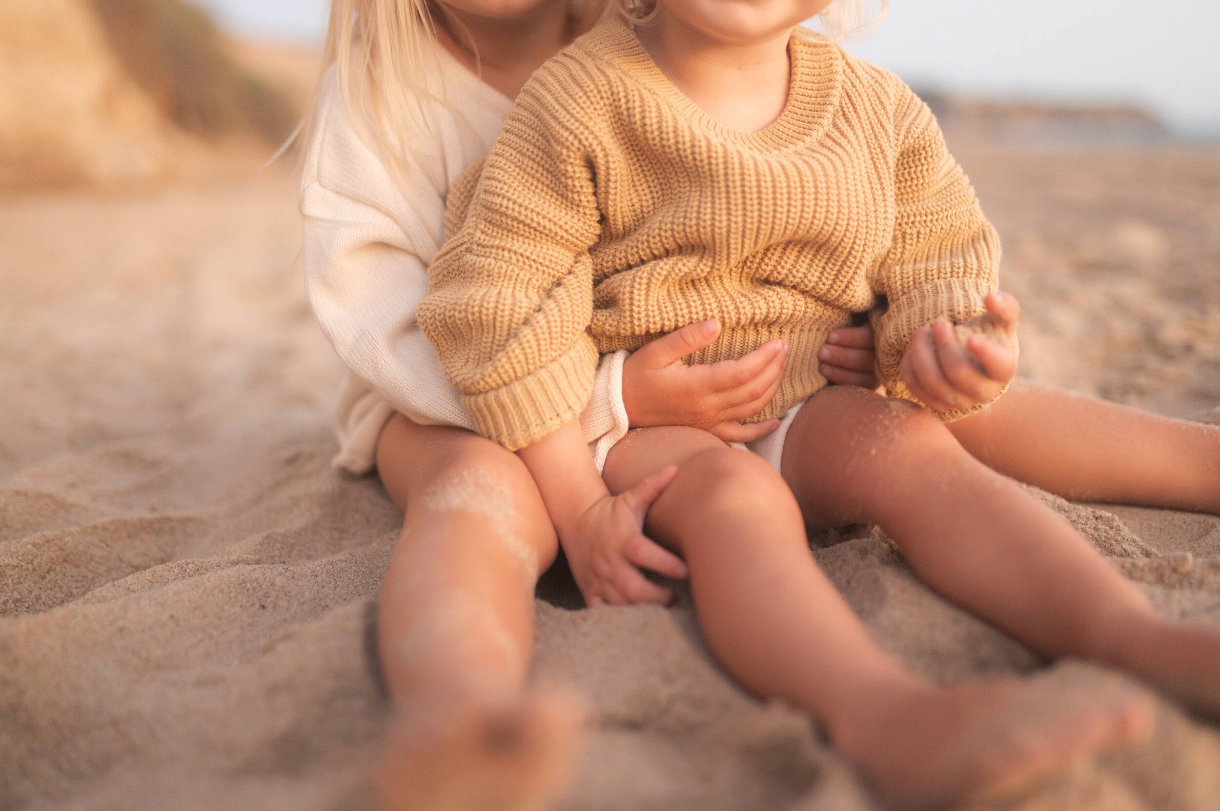
Color is one of the most powerful tools in shaping mood. Selecting a color palette and sticking to it across multiple images helps tie your content together. Whether you prefer warm earthy tones, soft pastels, deep blues, or muted monochromes, defining a palette simplifies editing choices and strengthens visual cohesion. For example, pairing sandy browns with faded teal can evoke calm, while bright orange with lavender gives a playful feel. Tools like GIMP allow for controlled color grading to reinforce your chosen palette with precision. (Important!) Avoid mixing too many unrelated colors that can disrupt flow.
Keep Editing Styles Aligned
Develop a signature approach for all your edits
To maintain aesthetic unity, it's crucial to use a consistent editing style. This includes your approach to contrast, brightness, highlights, saturation, and sharpness. Once you've developed a style that reflects your taste and intent, apply those same values to all your images. This doesn’t mean using the exact same values, but staying within a defined visual range. A smooth, low-contrast approach will have a different mood from a high-clarity, high-saturation one. What matters is that your style stays recognizable and intentional.
Mood-Driven Adjustments
Edit with the emotional tone in mind
Every photo carries an emotional layer. Editing to support that mood makes your image more compelling. For a cozy, nostalgic feel, lower contrast, warm up the tones, and soften shadows. For dramatic impact, use high contrast with cooler tones and sharper lines. The key is matching the visual treatment to the message or feeling behind the photo. Mood-driven edits help your audience feel more connected to your content, creating a deeper emotional impression.
Minimalism Creates Balance
Simplicity enhances clarity and visual comfort
Minimalist edits allow the subject to breathe and the image to remain clean and elegant. Avoid overcrowding your photo with heavy adjustments or unnecessary visual elements. Let color, space, and light work together. Minimal edits might involve subtle shadow work, gentle brightness, and a soft vignette to guide the viewer’s eye. With tools like GIMP , you can make these changes delicately, ensuring that nothing in the image distracts from your intended focus.
Repetition Strengthens Your Style
Consistency is built through editing habits
The more consistently you edit and present your images, the more your aesthetic becomes recognizable. Repeating similar hues, exposures, or framing styles creates a pattern viewers will associate with your work. Use the same tonal structures and avoid dramatic shifts from one image to the next unless intentionally breaking the rhythm. Repetition doesn’t limit creativity—it sharpens your visual signature and helps you stand out in a crowded space.
Use Light and Texture Wisely
Refined detail adds personality without clutter
Lighting direction and surface texture can change the mood significantly. Soft lighting suggests calmness, while sharp lighting builds drama. Similarly, adding or reducing texture can shift focus and emotion. For example, smooth textures make for sleek and modern looks, while retaining natural textures gives an organic, grounded feel. Stay mindful of how your editing style interacts with these physical elements. If you keep your lighting and texture approach consistent, your photos will feel more unified and immersive.
Preview Your Work in Groups
Evaluate how images interact side by side
Before sharing a set of images, review them together. Do they feel like they belong to the same series? Do their colors clash or complement each other? Viewing your photos as a grid or gallery makes it easier to spot inconsistencies and adjust accordingly. Often, a small tweak in color balance or shadow depth can bring an outlier back in harmony with the rest. This process of reviewing in context helps sharpen your eye and refine your overall visual output.
Define Your Signature Mood
Your aesthetic should reflect your message
Ultimately, the goal is to build a visual identity that represents your personal or professional message. Whether your style is moody and intimate, bright and cheerful, or crisp and minimal, stay true to it. Let your aesthetic choices reflect the values and emotions you want to share. With time, intention, and tools like GIMP , you’ll shape an unmistakable style that transforms ordinary photos into meaningful visual stories. (Important!) Consistency in tone and mood creates a lasting impression on your audience.